
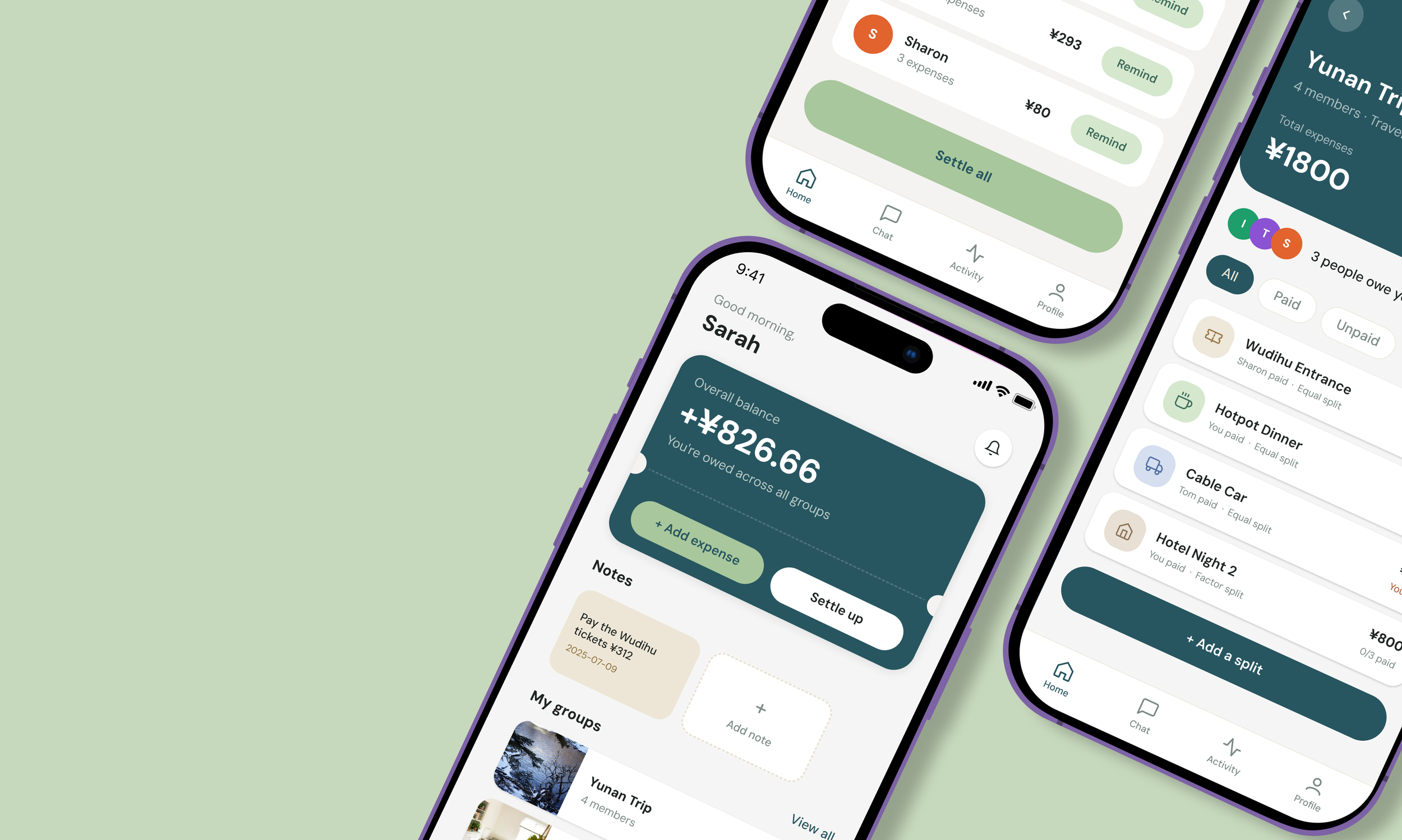
Expenses sharing App
An expense-sharing app that helps groups quickly record, split, and settle costs efficiently.
Tools
Figma ,Claude Design, Figma Make, Gpt
Period
2 weeks, June 2026
User research, UX UI Design

Discover
Mvp
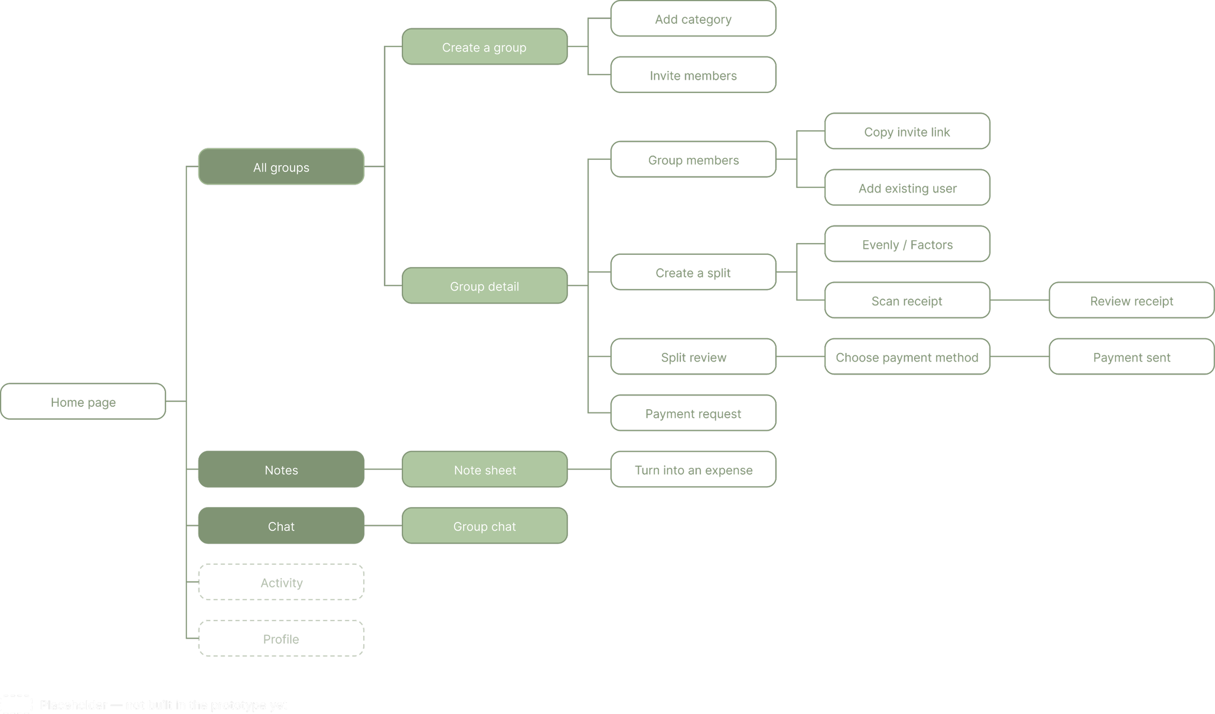
Information Architecture
Context
I wanted to see how far a product designer could take an idea with AI and Vibe Coding from concept to working product in two weeks. This project started from personal frustration: after group trips with friends, settling shared expenses always meant spending far too long trying to remember who paid for what every time. That gap became the starting point for SplitUp, an expense-sharing app designed to make recording, splitting, and settling group costs fast and low-friction.
In the early discovery phase, I used structured conversational research to define the product's scope.
The exploration centered on three questions:
- How do people currently manage group expenses?
- Difficulties encountered when managing expenses
- Functions the app needs and doesn't need
After defining the product's core functions, I outlined the key steps to establish the overall usage logic and the relationships between pages. During this process, I consulted with Claude regarding the product's structure and technical constraints, and drafted a PRD to clarify the product details.
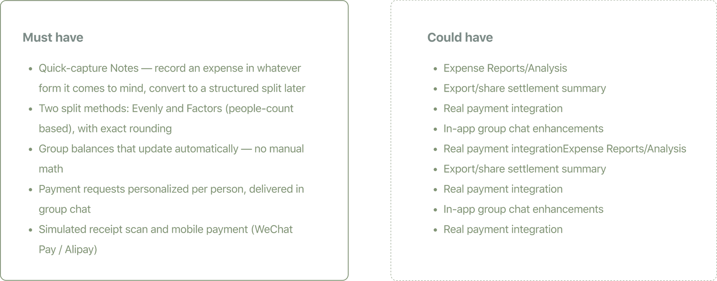
After conducting preliminary research on the product, the product's MVP was determined.
Define
Reflection
AI tools changed what exploration cost. Comparing a dozen color directions or
generating a clickable prototype took minutes instead of days, so I could test more
options than I otherwise would have.
But speed didn't replace judgment. AI could produce directions , it couldn't tell me
which one avoided feeling like a finance app. That filtering stayed manual, checked
against the same three words every time: calm, everyday, low-pressure. Even with
design.md written down, Figma Make's output still needed several rounds of
comparing against the rules and correcting drift by hand the written rules were
what I kept checking against, not a step AI let me skip.
Make a note
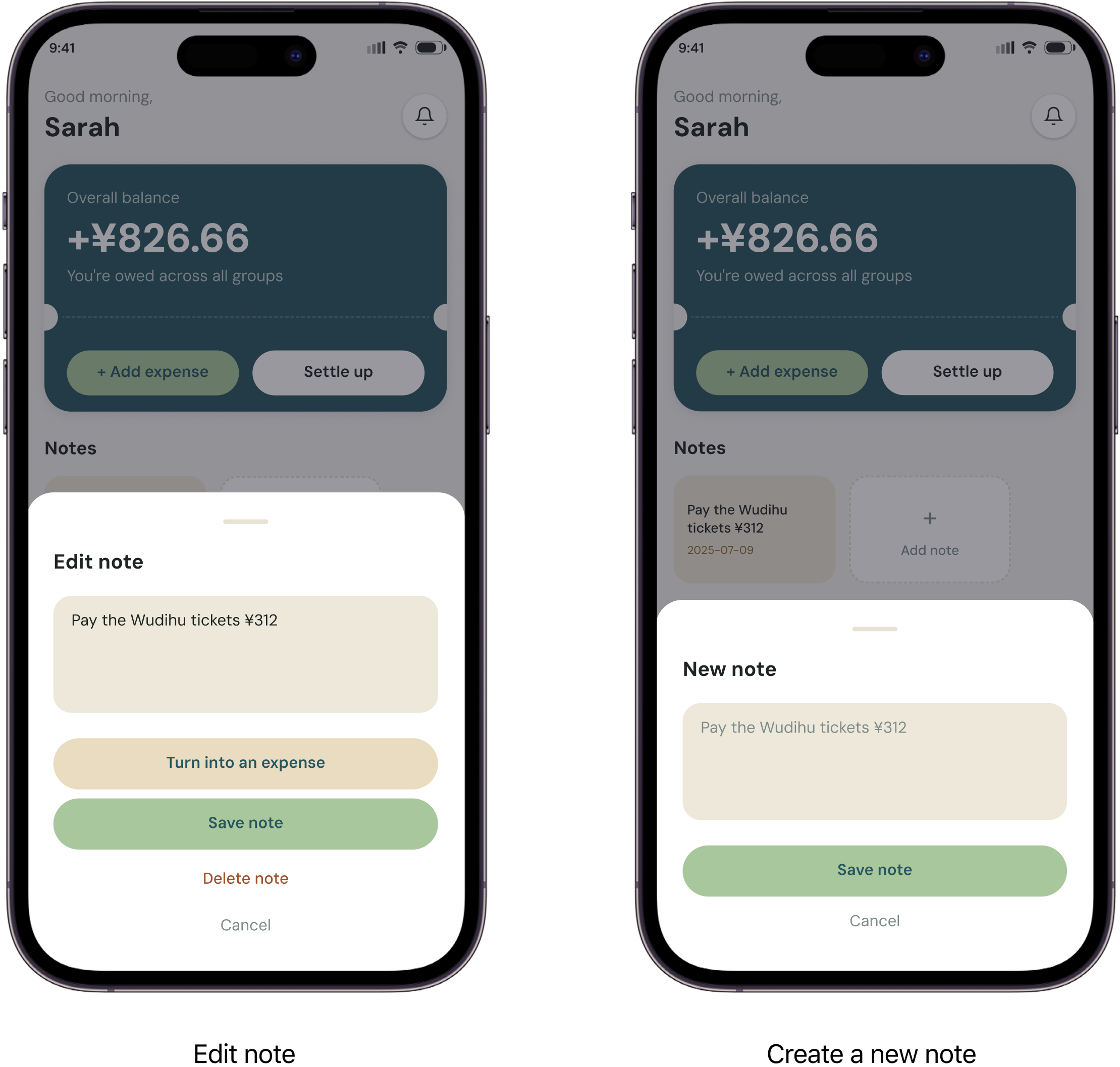
Notes exists for the moment an expense happens before there's time to structure it
properly a quick line like "paid for tickets, ¥312" is enough. Converting that
note into a full expense later removes the upfront effort that usually stops people
from logging small or spontaneous costs in the first place.
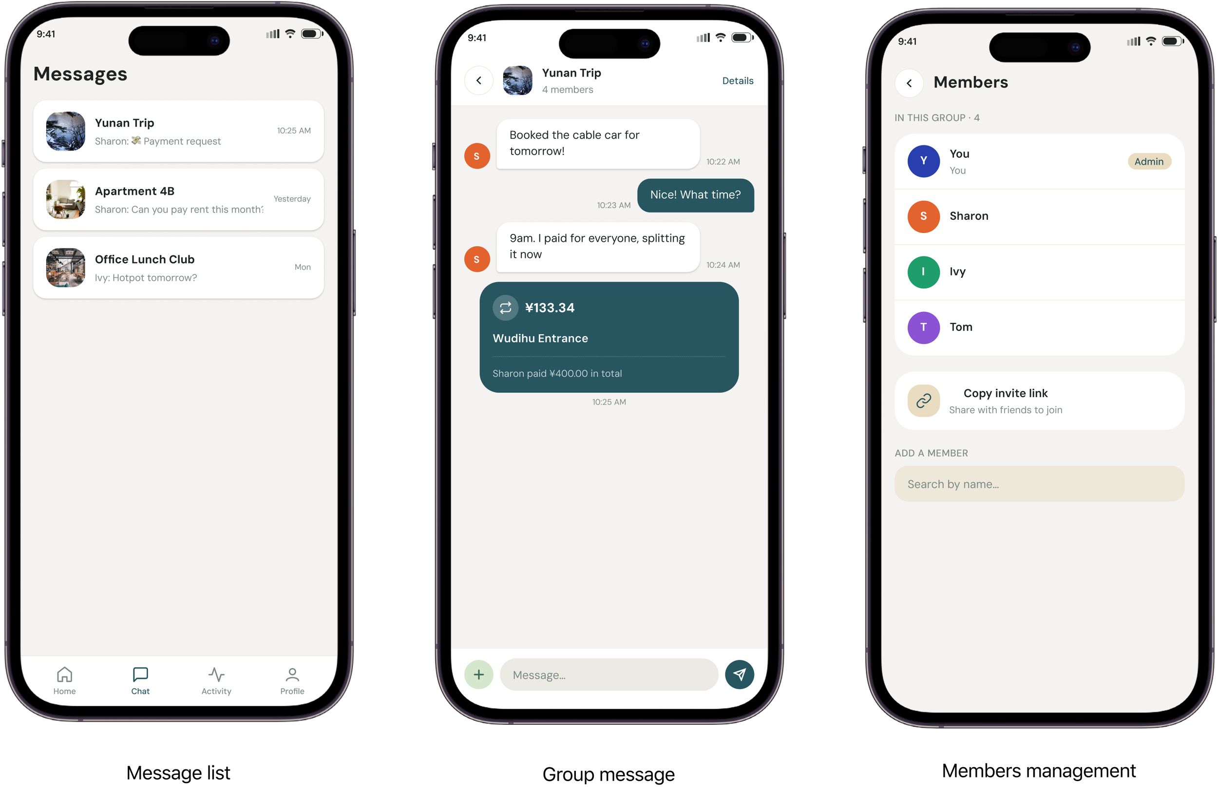
Group Chat
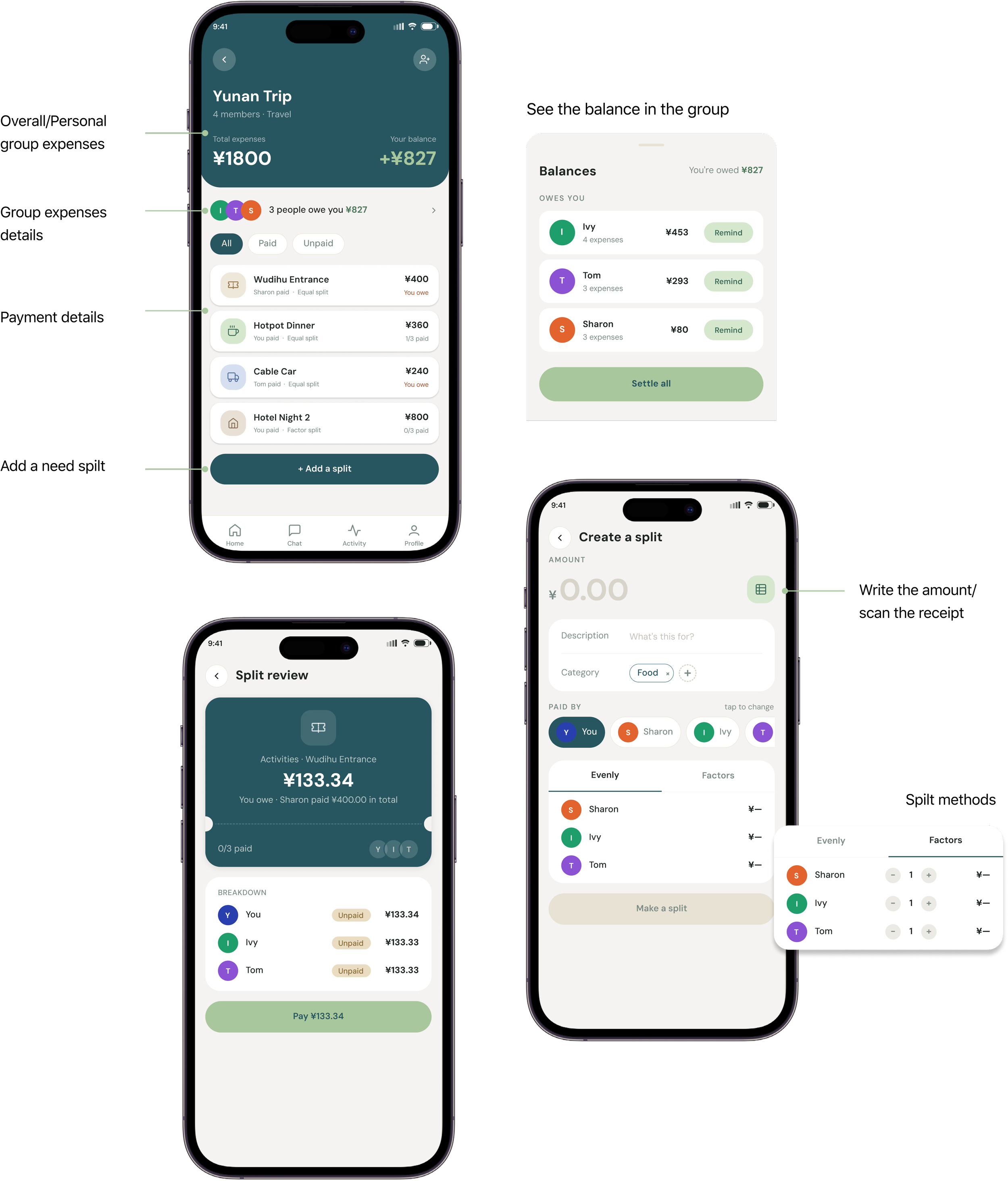
Where a split actually gets settled. A payment request appears as a
message showing each person their own amount, and paying happens right where the
conversation already is.
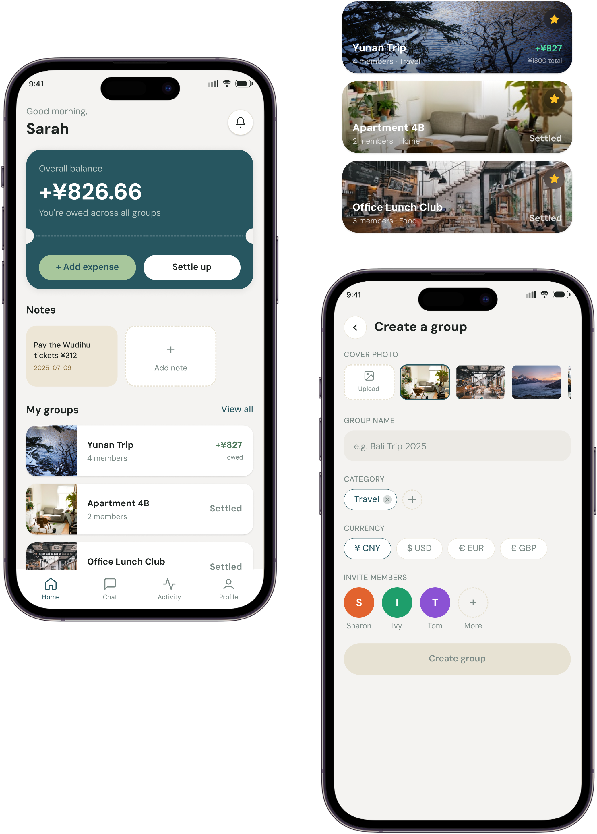
Home page
The Home screen answers the one question a person opens the app to ask: do I owe
anyone, or is anyone owed to me? The balance sits front and center, Notes offers a
zero-friction way to capture something before it's forgotten, and each group's
status is visible without opening it — so checking in takes one glance, not a
search.
Make a split
Make a Split is where an expense actually gets recorded and divided amount,
what it was for, who paid, and how it's split (Evenly or by Factors).
Style Guide
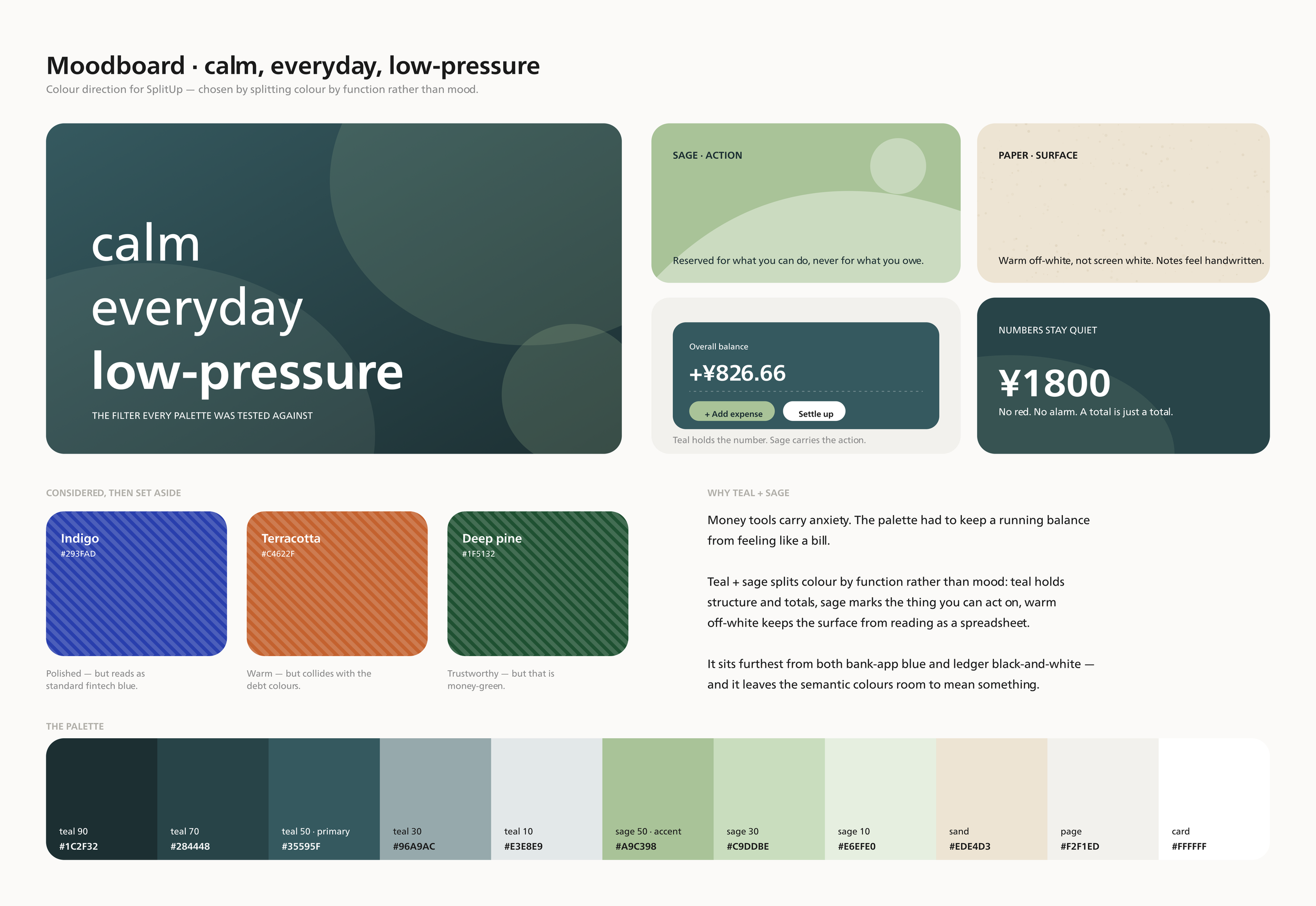
To avoid a "financial app" feel and reduce the anxiety often tied to money-tracking
tools, I framed the visual direction around three words: calm, everyday,
low-pressure. I tested that filter against several palettes — indigo (polished, but
read as standard fintech blue), terracotta (warm, but clashed with the semantic debt
colors), deep pine (trustworthy, but too close to typical "money" green) — before
landing on teal + sage, which splits color by function rather than mood and stays
furthest from both bank-app blue and spreadsheet black-and-white.
Design system
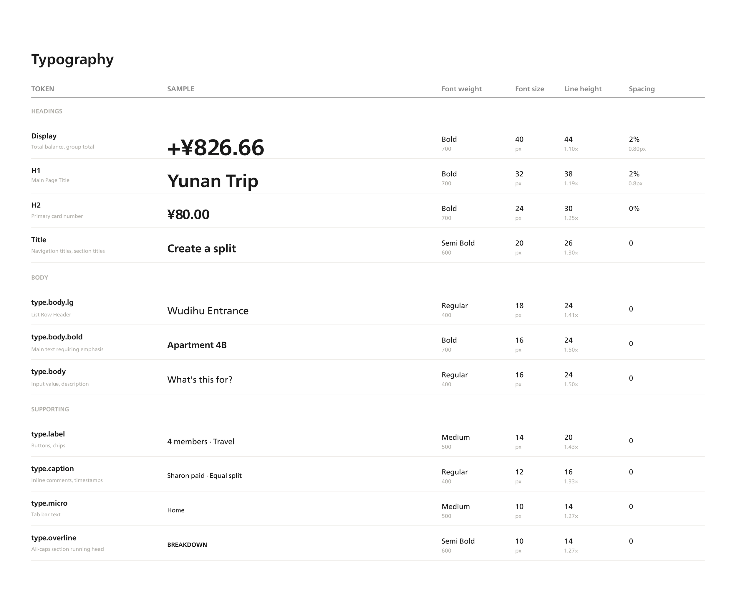
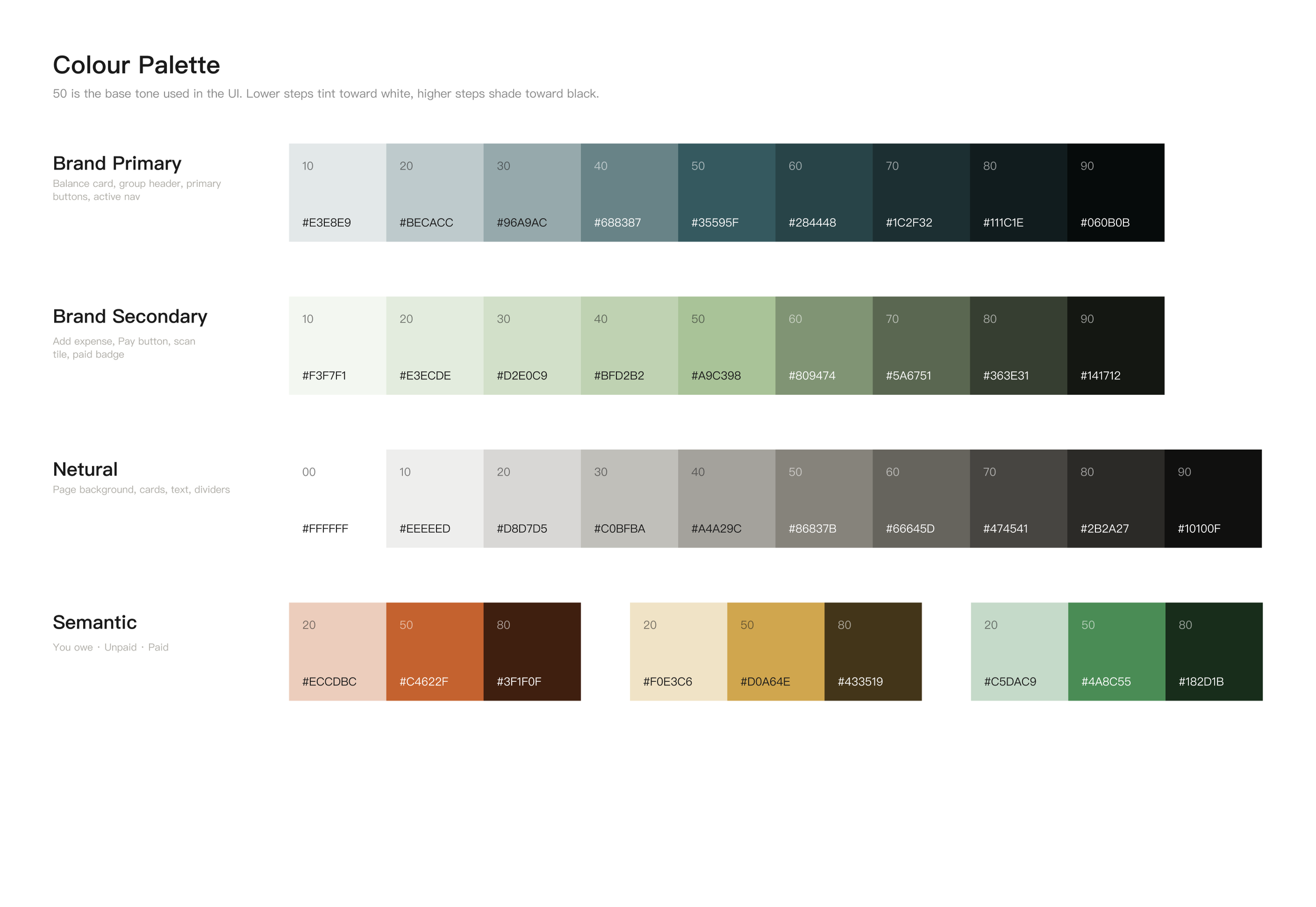
With the identity settled, the next step was translating "calm, everyday,
low-pressure" into concrete color and typography decisions — not just picking
values that looked right, but defining what role each one plays. Those decisions
later became the foundation for a living design system (design.md), so any new
screen could be built consistently without re-deriving the rules from scratch.
Design Iterations
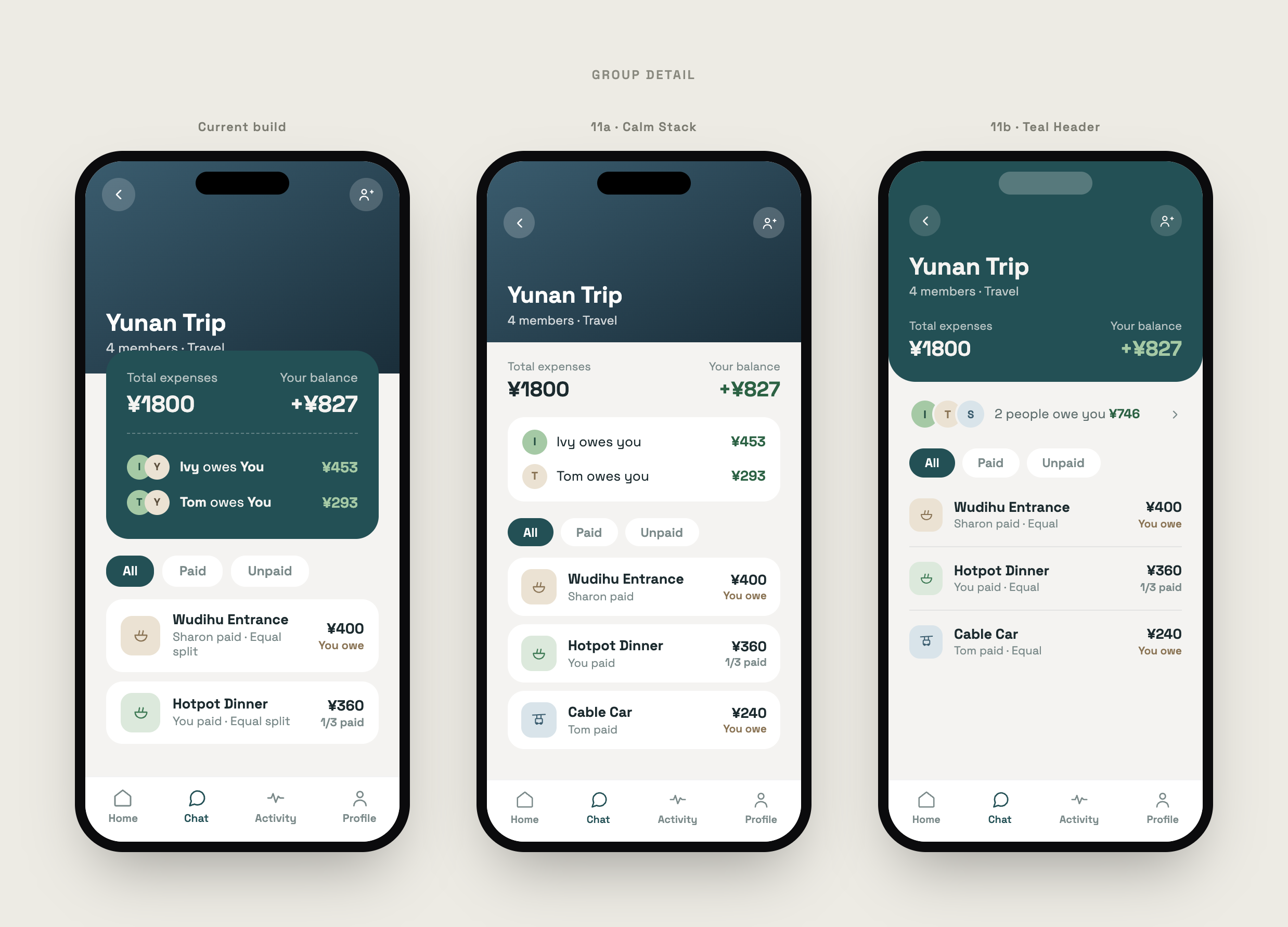
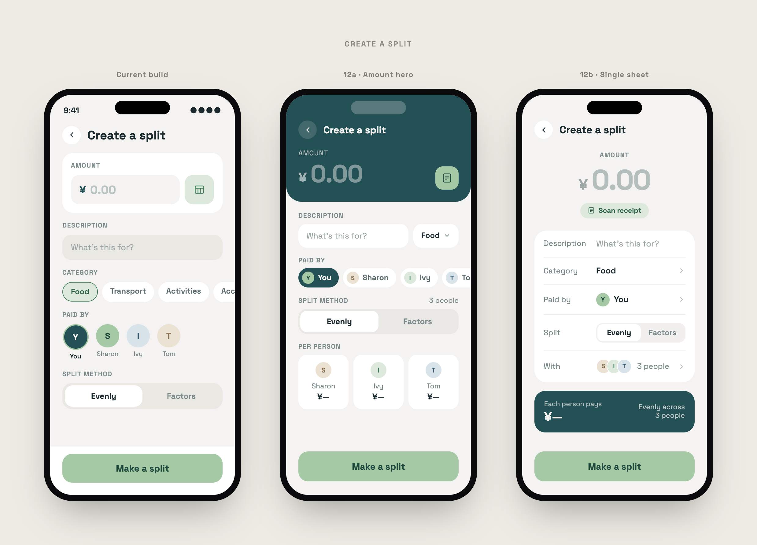
Two screens saw the most iteration: Create a Split, and the group balance view —
both control the moment someone has to trust the numbers in front of them.
The balance view took several rounds to get right. Early versions led with the
expense's total as the biggest number, which caused people to misread their own
amount owed. After testing a few fixes — smaller totals, bolded personal shares,
two-column layouts — the rule that stuck was simple: the viewer's own share is
always the largest number on the card; the total is always secondary. That one
change did more for trust than any visual polish.
Final Design
With the core screens and user flow defined in design.md, I used Figma Make to
generate an interactive version of the app. Even with a documented system in place,
translating it into a working prototype surfaced details the static rules hadn't
accounted for — spacing, empty states, edge cases — so the screens below went
through several more rounds of refinement before reaching their current form.