
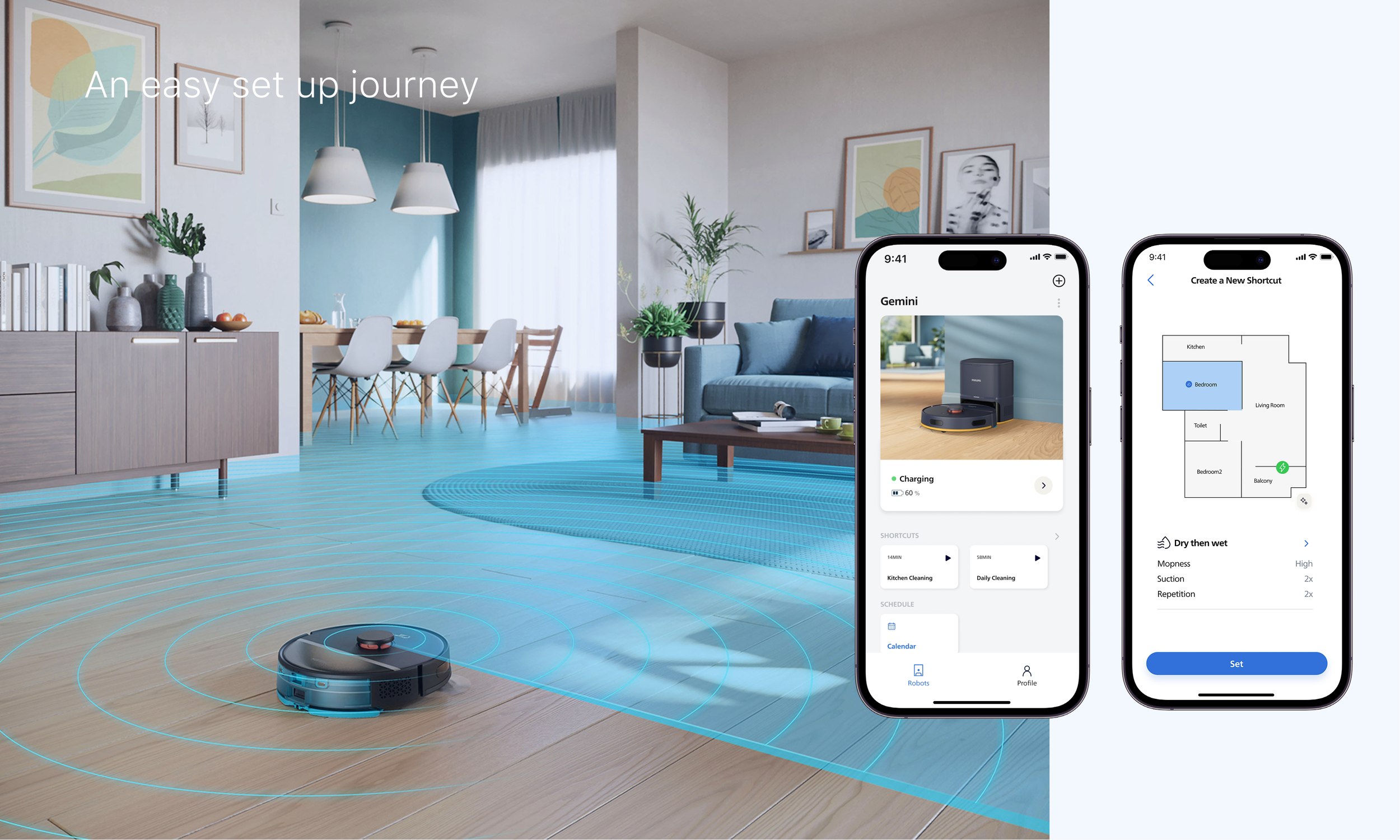
Expenses sharing App
An expense-sharing app that helps groups quickly record, split, and settle costs efficiently.
User research, UX UI Design
Period
2 weeks, June 2026
Tools
Figma ,Claude Design, Figma Make, Gpt

Discover
Mvp
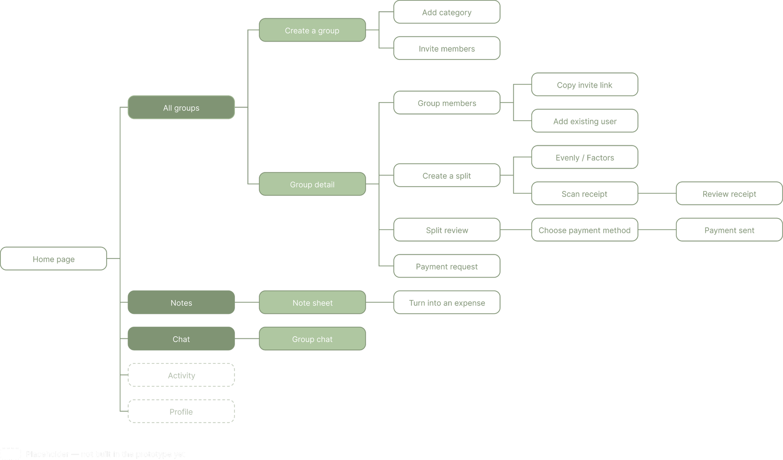
Information Architecture
Context
This project started from personal frustration: after group trips with friends, settling shared expenses always meant spending far too long trying to remember who paid for what every time. That gap became the starting point for SplitUp, an expense-sharing app designed to make recording, splitting, and settling group costs fast and low-friction.
In the early discovery phase, I used structured conversational research to define the product's scope.
The exploration centered on three questions:
- How do people currently manage group expenses?
- Difficulties encountered when managing expenses
- Functions the app needs and doesn't need
After defining the product's core functions, I outlined the key steps to establish the overall usage logic and the relationships between pages. During this process, I consulted with Claude regarding the product's structure and technical constraints, and drafted a PRD to clarify the product details.
After conducting preliminary research on the product, the product's MVP was determined.
Must have
Quick-capture Notes — record an expense in whatever form it comes to mind, convert to a structured split later
Two split methods: Evenly and Factors (people-count based), with exact rounding
Group balances that update automatically — no manual math
Payment requests personalized per person, delivered in group chat
Simulated receipt scan and mobile payment (WeChat Pay / Alipay)
Define
Design Impact
The completion time for core, high-frequency tasks was reduced by 57%.
Meanwhile, the composite score for user trust in the AI's decision-making logic rose from 2.35 to 4.0 (on a 5-point scale)—a 70% increase—validating the successful realization of two key design goals: "extreme simplification of daily operations" and "AI capabilities that are both perceptible and trustworthy."
Final Design
Key Features
AI Assistant
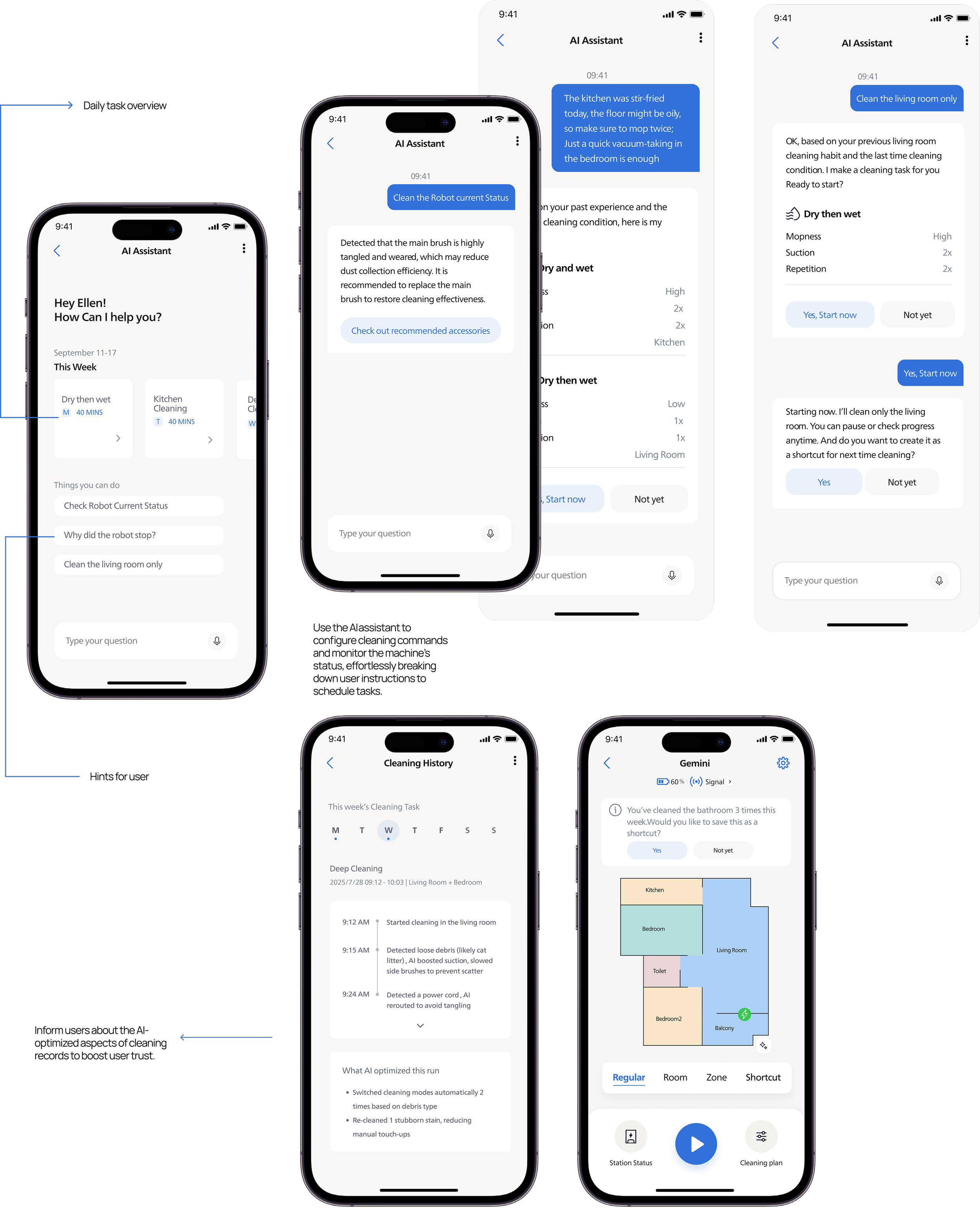
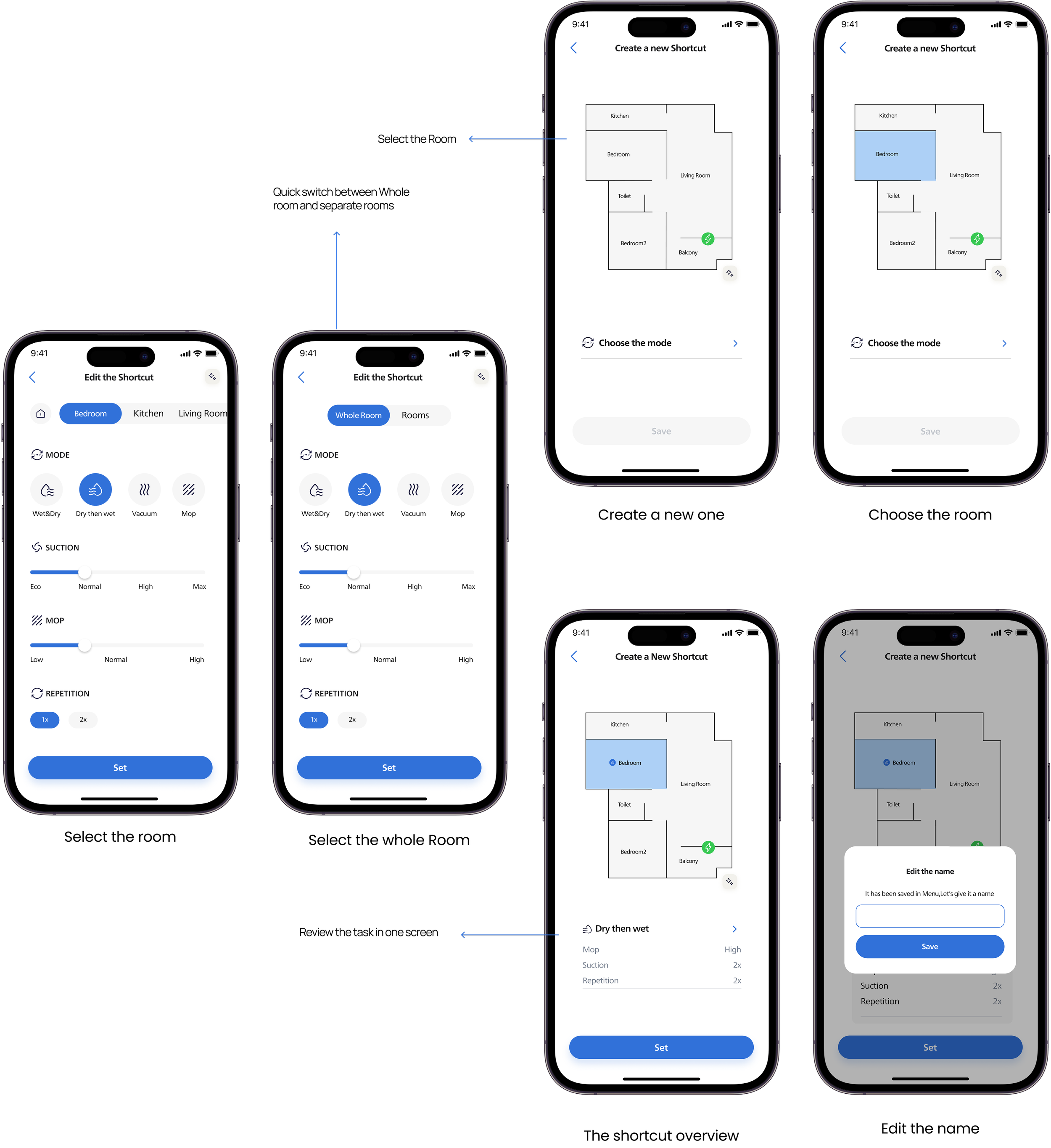
For some users, they prefer to schedule their cleaning tasks in advance, the shortcut selection is also linked to the cleaning method options.
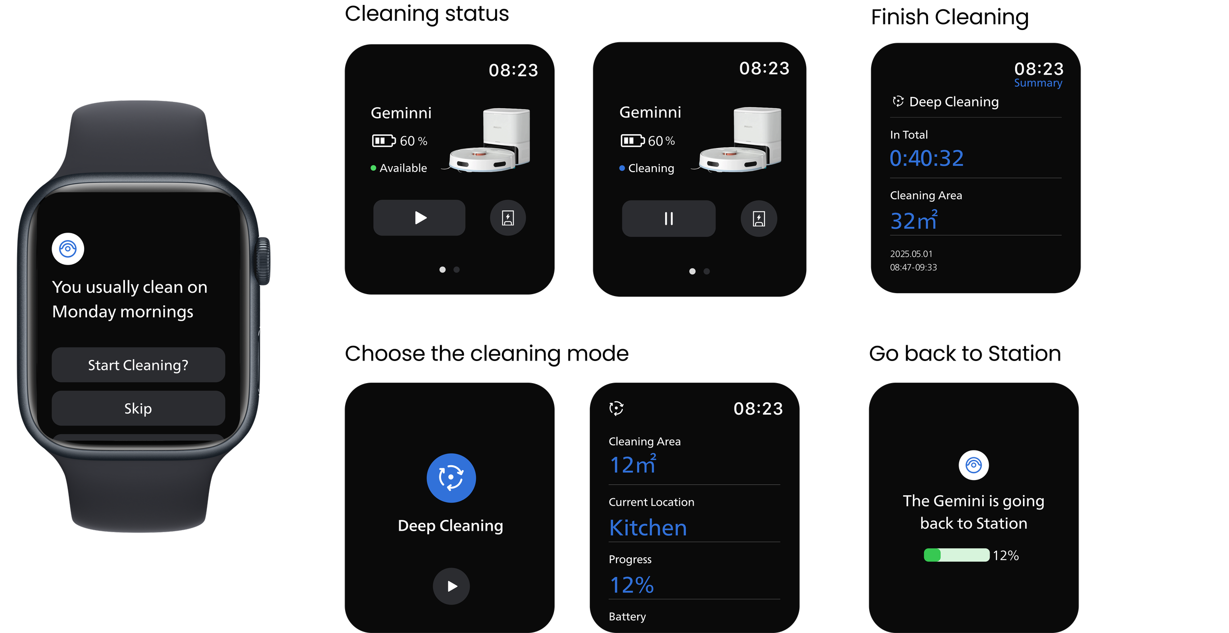
Watch companion
It surfaces the shortcut library on the wrist for the moments when the phone is out of reach — cooking, exercising, leaving the house.
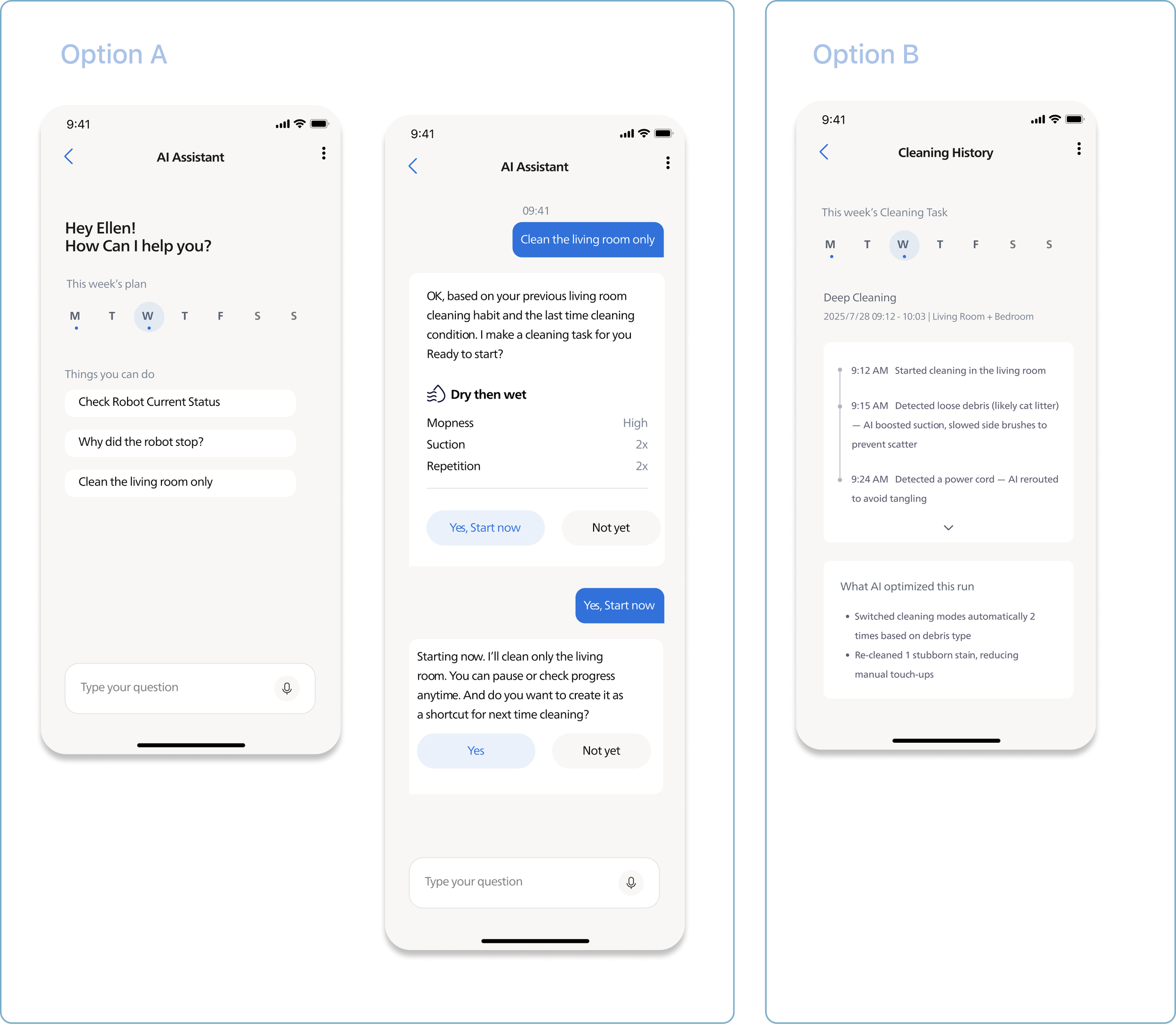
AI assistant
AI needs to bridge the trust gap between users and technology. Pain points cluster around three moments: before starting a task, during cleaning issues, and after cleaning when users often don't feel the AI helped. We explored two directions: an AI assistant for conversational adjustments, and post-cleaning summaries showing what AI improved. Both tested well, needing only minor hierarchy refinements.
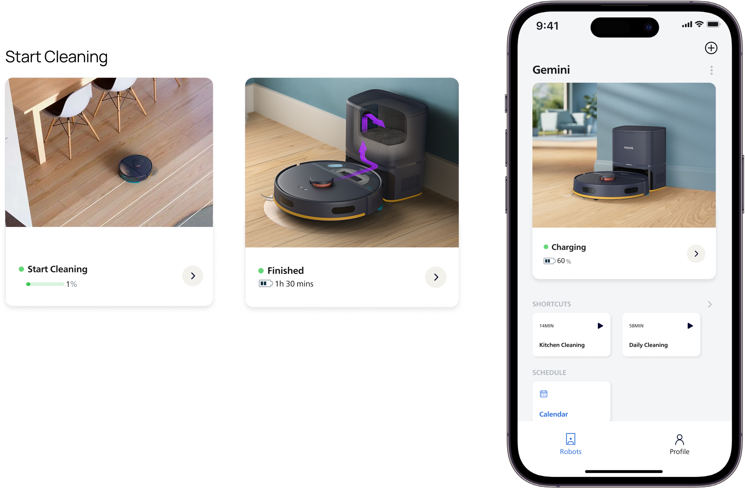
Home Page
User can start a quickly cleaning in the home page. Pre-configured bundles of room + mode + intensity. Fast and customizable.
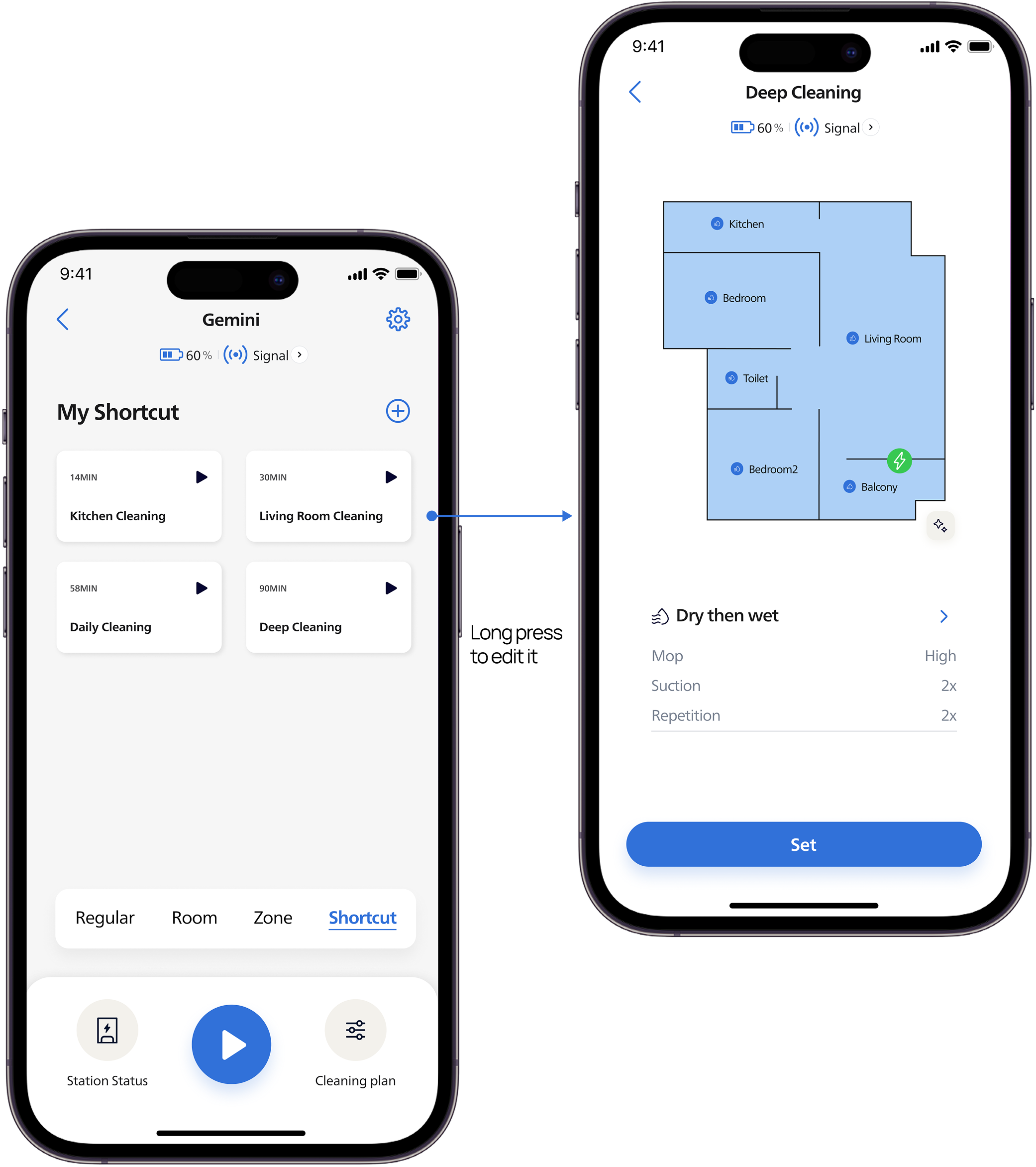
Shortcut List
The system provides a default shortcut for users to use out of the box.
Create a new shortcut
Users can quickly start a cleaning task on the home page. Pre-configured bundles of room + mode + intensity. Fast and customizable.
Style Guide
Regarding the product's branding, the goal was to create an app that avoids a "financial" feel and steers clear of inducing user anxiety; instead, the positioning focuses on a gentle, lifestyle-oriented, and low-pressure Fintech aesthetic. Guided by this approach, I defined the visual style using mood boards. During the initial visual exploration phase, I utilized Claude to assist in generating various visual directions, but ultimately selected the current color scheme based on the established product positioning.